Build a page that looks perfect on your laptop, then open it on a smaller screen and everything shifts. Buttons wrap. Navigation breaks. Hero sections become oversized. This is exactly why a webpage screen resolution simulator matters.
Developers already know responsive design is not optional. The problem is that real-world screen sizes, browser dimensions, zoom levels, and device behavior rarely match the neat breakpoints used during development. A simulator gives you a faster way to preview how a page behaves across common resolutions before users find the problems for you.
In this guide, you’ll learn what a webpage screen resolution simulator does, when to use it, where it falls short, and how to turn quick previews into a reliable testing workflow. If you’re debugging layout issues, refining breakpoints, or reviewing a new UI, this will help you test more accurately and waste less time.
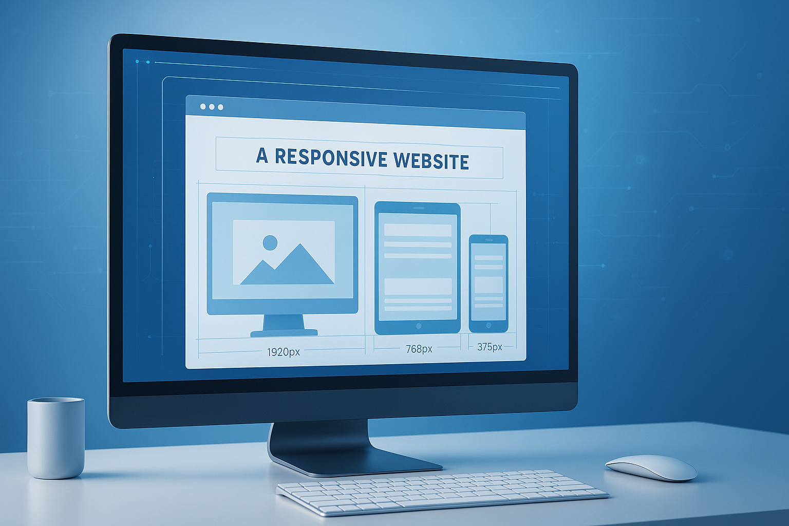
Suggested Image: Technology concept showing one webpage previewed across multiple screen sizes on desktop, tablet, and mobile frames
What is a webpage screen resolution simulator?
A webpage screen resolution simulator is a tool that displays a webpage inside different viewport sizes so you can see how layouts respond to varying screen widths and heights. It helps developers preview responsive behavior quickly without needing every physical device on hand.
At its core, the tool changes the visible browser area, not the actual hardware. That distinction matters. It can show whether your grid collapses properly, whether text wraps cleanly, and whether images scale as expected. It cannot fully reproduce every device-specific difference such as touch behavior, browser UI chrome, rendering quirks, or performance constraints.
If you’re reviewing layout dimensions, a quick companion tool like an pixels to rem converter can also help when adjusting typography and spacing across breakpoints.
- Preview pages at common desktop, tablet, and mobile resolutions
- Check responsive breakpoints visually
- Spot overflow, clipping, and alignment problems
- Test whether content remains usable at smaller viewports
- Speed up front-end QA before testing on real devices
Why developers use a screen resolution simulator
Developers use simulators because they reduce friction. Instead of manually resizing a browser and guessing viewport sizes, you can jump straight into common resolutions and compare behavior in seconds.
Here’s the practical advantage. Responsive bugs often hide in the gaps between your major breakpoints. A page may look fine at 1440px and 768px but fail horribly at 1024px, 912px, or 390px. A simulator makes those edge cases easier to inspect. When paired with standards-based responsive techniques from MDN’s responsive design guide, it becomes a fast feedback layer during development.
Common situations where it helps
- Checking a landing page before release
- Testing a new navigation menu across viewports
- Reviewing dashboard layouts with tables and sidebars
- Verifying form usability on smaller screens
- Inspecting ad placements, popups, or sticky elements
- Validating CMS content that editors may have formatted inconsistently
For pages with visual assets, developers often combine simulator testing with image optimization. If oversized images are breaking layouts or slowing mobile rendering, an Image Compressor can help reduce file size without complicating your workflow.
What a simulator can test well and what it cannot
A simulator is excellent for layout review, but it is not the same as full device testing. Use it for fast screening, then confirm important experiences on real hardware and in browser dev tools.
| What a simulator does well | What it may not reproduce accurately |
|---|---|
| Viewport-based layout behavior | Actual touch interactions and gestures |
| Breakpoint changes in CSS | Browser-specific rendering quirks |
| Text wrapping and content overflow | Mobile browser UI behavior |
| Image and container scaling | Device memory, CPU, and network performance |
| General visual QA | Accessibility support in real assistive environments |
This is where many people struggle. They treat a simulator as final proof that a page is mobile-ready. It isn’t. Google also recommends testing mobile usability more broadly, especially when evaluating indexing and user experience, as explained in Google Search Central documentation.
How to use a webpage screen resolution simulator effectively
The most effective way to use a simulator is to test by task, not just by screen size. You’re not only asking, “Does it fit?” You’re asking, “Can a user complete the job without friction?”
- Start with your most important pages. Test homepages, landing pages, pricing pages, checkout flows, dashboards, and forms first.
- Choose realistic viewport sizes. Include common mobile, tablet, laptop, and widescreen dimensions.
- Check critical breakpoints. Review where columns collapse, menus change state, and typography shifts.
- Test long content. Scroll through full pages. Problems often appear far below the hero section.
- Inspect interactive elements. Buttons, dropdowns, modals, sticky bars, and tables deserve extra attention.
- Repeat after content changes. Responsive issues often appear after copy edits, image swaps, or CMS updates.
If your testing includes spacing and width calculations, tools like a CSS unit converter can help standardize values when moving between px, rem, em, and percentages.
A simple testing checklist
- Does the header stay usable?
- Does navigation remain accessible and readable?
- Do buttons stay large enough to interact with comfortably?
- Do cards and columns stack in a logical order?
- Do forms fit without horizontal scrolling?
- Do images preserve aspect ratio?
- Do tables overflow or require alternate mobile handling?
- Do popups block key content?
- Does the footer remain readable and tappable?
Which screen resolutions should you test in 2026?
You do not need to test every possible device size. You do need a sensible spread of viewport categories that reflects how people actually browse. Focus on patterns, not perfection.
Modern responsive testing should include narrow mobile viewports, larger phones, common tablets, compact laptops, standard desktops, and wider monitors. Screen sizes keep changing, but the underlying goal remains stable: make your layout resilient between and beyond breakpoints. Guidance from web.dev responsive design basics is still a strong foundation for this approach.
| Viewport category | Example widths to test | Why it matters |
|---|---|---|
| Small mobile | 320px, 360px | Exposes tight spacing and overflow issues |
| Large mobile | 390px, 414px, 430px | Covers common modern smartphone sizes |
| Tablet portrait | 768px, 800px | Often reveals awkward in-between layouts |
| Tablet landscape or small laptop | 1024px, 1112px | Useful for navigation and sidebar testing |
| Standard desktop | 1280px, 1366px, 1440px | Represents common work and home setups |
| Large desktop | 1600px, 1920px | Checks line length, whitespace, and scaling |
Suggested Infographic: Responsive breakpoint map showing mobile, tablet, laptop, desktop, and widescreen testing ranges
Best practices for accurate responsive testing
A simulator becomes far more useful when you combine it with a disciplined testing process. The tool gives you visibility. Your workflow creates accuracy.
- Test content-heavy pages, not just polished mockups. Real text and CMS blocks behave differently from design comps.
- Use fluid layouts where possible. Overly rigid fixed-width assumptions fail between named breakpoints.
- Check font scaling and readability. Use relative units and verify line length at both small and wide screens.
- Audit images and media. Oversized assets can distort layout and crush mobile performance.
- Review forms in full. Labels, validation messages, and multi-step flows often break first.
- Pair visual testing with accessibility review. Layout is only one part of usability.
For accessibility, it’s worth cross-checking your interface against WCAG guidance from W3C. A page that fits the screen but becomes hard to read or operate still fails users.
If you’re cleaning up assets before testing final layouts, an image resizer tool can help prepare more realistic media dimensions for responsive previews.
Common mistakes when using a webpage screen resolution simulator
Most testing errors happen because developers move too quickly from visual preview to sign-off. A simulator is a strong first pass, but a weak final verdict.
- Testing only popular sizes. Many breakages appear between major breakpoints.
- Ignoring height. Width gets all the attention, but viewport height affects modals, sticky elements, and above-the-fold layout.
- Checking only the first screen. Long pages often fail farther down.
- Forgetting landscape mode. Tablets and phones in landscape can create unusual constraints.
- Assuming mouse behavior equals touch behavior. Hover states and tap targets need separate thought.
- Skipping performance checks. A layout that technically fits may still feel broken on slower devices.
Now comes the important part. If your workflow includes screenshots, handoff notes, or design review documents, keeping files light and easy to share matters too. A PDF compressor can help when exporting QA reports or annotated layout reviews.
Simulator vs browser dev tools vs real devices
Each testing method serves a different purpose. Experienced developers do not choose one. They layer them.
| Method | Best for | Main limitation |
|---|---|---|
| Screen resolution simulator | Fast visual layout checks | Limited device realism |
| Browser dev tools | Debugging CSS, media queries, network, emulation | Still not identical to physical devices |
| Real devices | Final usability and interaction validation | Higher cost and slower coverage |
For implementation details, Chrome DevTools device mode documentation is especially helpful because it shows how to emulate viewports, inspect media queries, and test responsive behavior directly in the browser.
The best workflow for most teams
- Use a simulator for quick page-wide checks.
- Use browser dev tools to investigate layout bugs and media queries.
- Use real devices for final validation of crucial user flows.
The answer depends on one thing: risk. If you’re testing a marketing page, simulation plus dev tools may be enough for early review. If you’re testing a checkout flow, booking engine, or app dashboard, real-device validation becomes much more important.
How responsive testing supports SEO and UX
Responsive design is not just a front-end concern. It affects search visibility, engagement, accessibility, conversions, and perceived quality. A page that frustrates mobile users often underperforms everywhere.
Google has long emphasized mobile-friendly experiences, and layout stability also matters for usability. If critical elements shift, overlap, or become unreadable, users bounce faster and complete fewer actions. Core quality signals discussed in web.dev’s Core Web Vitals overview connect directly to how stable and usable pages feel across screens.
- Better readability reduces bounce risk
- Cleaner mobile layouts improve task completion
- Stable spacing helps prevent accidental taps
- Responsive images improve load speed
- Consistent structure supports crawlable, accessible content
If you’re reviewing mobile SERP presentation or on-page structure during a redesign, a related SEO tools collection can help support broader optimization work beyond layout testing alone.
A practical example: testing a product landing page
Let’s break this down with a real scenario. Say you’ve built a landing page with a hero banner, three feature cards, a testimonial section, and a sign-up form. On desktop it looks polished. But what happens at smaller widths?
Using a webpage screen resolution simulator, you might find the following:
- At 360px, the hero heading wraps into five lines and pushes the call-to-action too far down
- At 390px, the feature cards stack correctly but icon spacing feels cramped
- At 768px, the testimonial carousel overlaps navigation arrows
- At 1024px, the sign-up form and feature list compete for horizontal space
- At 1440px, the body text becomes too wide for comfortable reading
Here’s what experienced professionals do differently. They don’t just patch each width individually. They improve the underlying system:
- Use
max-widthconstraints for text containers - Set flexible grid behavior instead of hard-coded widths
- Adjust spacing with relative units
- Scale images with container-aware rules
- Review actual content lengths instead of placeholder copy
If content length is part of the issue, a quick word counter tool can help writers and developers keep UI copy within more realistic limits for smaller layouts.
What to look for during a quality review
When a page “looks responsive,” that often means only one thing: nothing obviously broke. A better review asks whether the interface still feels deliberate at every size.
Layout quality signals
- Consistent spacing between visual sections
- Readable line length on large screens
- No horizontal scrolling for core content
- Balanced stacking order on mobile
- Predictable alignment of text, forms, and controls
Interaction quality signals
- Buttons remain visible and easy to tap
- Menus open without clipping or overlap
- Sticky bars do not block content
- Dialogs fit within smaller heights
- Carousels do not trap users or hide controls
Content quality signals
- Headings remain scannable
- Tables have a mobile fallback strategy
- Lists and code samples wrap cleanly
- Error messages stay near the affected input
- Embedded media resizes without breaking rhythm
Suggested Screenshot: Side-by-side comparison of a well-optimized landing page versus a broken mobile layout in a resolution simulator
Frequently asked questions
1. Is a webpage screen resolution simulator the same as mobile testing?
No. A webpage screen resolution simulator mainly previews viewport dimensions and responsive layout behavior. It helps you see how a page adapts to different widths and heights, but it does not fully replicate real devices. You may miss touch-specific issues, browser chrome behavior, font rendering quirks, and performance limitations. It is best used as an early testing layer, not as your only validation method.
2. What is the difference between screen resolution and viewport size?
Screen resolution refers to the total number of pixels available on a device display. Viewport size is the visible area where the webpage actually renders inside the browser. Those two values are not always the same because browser UI, operating system controls, zoom settings, and device pixel ratio all affect what the user sees. For responsive testing, viewport size is usually the more important measurement.
3. Which pages should developers test first?
Start with the pages that affect revenue, lead generation, or product usability. That usually means your homepage, feature pages, pricing page, blog templates, checkout flow, account login, and any form-heavy pages. If you work on a web app, prioritize dashboards, tables, navigation states, and settings screens. Pages with dynamic content or editor-controlled layouts also deserve early testing because they break more often.
4. How many screen sizes do I really need to test?
You rarely need dozens of viewport sizes. For most projects, testing a thoughtful range across small mobile, large mobile, tablet portrait, tablet landscape, standard desktop, and large desktop is enough to catch the majority of layout problems. The bigger priority is testing the spaces between your breakpoints, where responsive logic often becomes awkward. A smaller set of strategic checks usually beats a huge but shallow test list.
5. Can a simulator help with accessibility?
It can help indirectly, but only in limited ways. A simulator makes it easier to spot layout problems that harm accessibility, such as clipped text, overlapping controls, poor content order, or unreadable spacing at smaller viewports. However, it does not replace keyboard testing, screen reader testing, color contrast review, or actual accessibility audits. Use it as a visual checkpoint, then validate accessibility separately with proper tools and real interaction tests.
6. Are free screen resolution simulators good enough for developers?
Free tools are often enough for quick responsive previews and early visual QA. They are especially useful when you need to switch between common viewport sizes quickly. However, as projects become more complex, you may also need browser dev tools, automated visual regression testing, and physical device checks. Free simulators are strong for speed and convenience, but they work best as part of a broader testing stack.
7. Should I test height as well as width?
Yes, absolutely. Width gets most of the attention because media queries often target it first, but viewport height affects many real-world issues. Sticky headers, cookie bars, popups, mobile keyboards, long forms, and modal windows can all create usability problems when the visible height is limited. A page may technically be responsive in width while still feeling cramped, broken, or frustrating because vertical space was ignored.
8. What should I do after finding a layout issue in a simulator?
First, confirm whether the issue is caused by content, spacing, fixed widths, media queries, or component behavior. Then reproduce it in browser dev tools so you can inspect the CSS and DOM more precisely. After making changes, retest the nearby viewport range instead of checking only the original problem size. Finally, validate critical fixes on a real device if the issue affects important user flows such as signups, payments, or navigation.
Final thoughts
A webpage screen resolution simulator is one of the fastest ways to catch responsive layout problems before they become user complaints. It helps you preview breakpoints, inspect content flow, and review design decisions across common viewport sizes with much less friction.
Still, the real value comes from how you use it. Treat it as a smart first pass, not a final guarantee. Combine simulator checks with browser dev tools, accessibility review, image optimization, and real-device testing for high-impact pages.
If you want to keep improving your workflow, the next practical step is simple: test your key pages at a wider range of viewport sizes, then tighten the details with tools like the pixels to rem converter, Image Compressor, image resizer tool, and SEO tools collection. Those small supporting fixes often make the biggest difference in responsive quality.