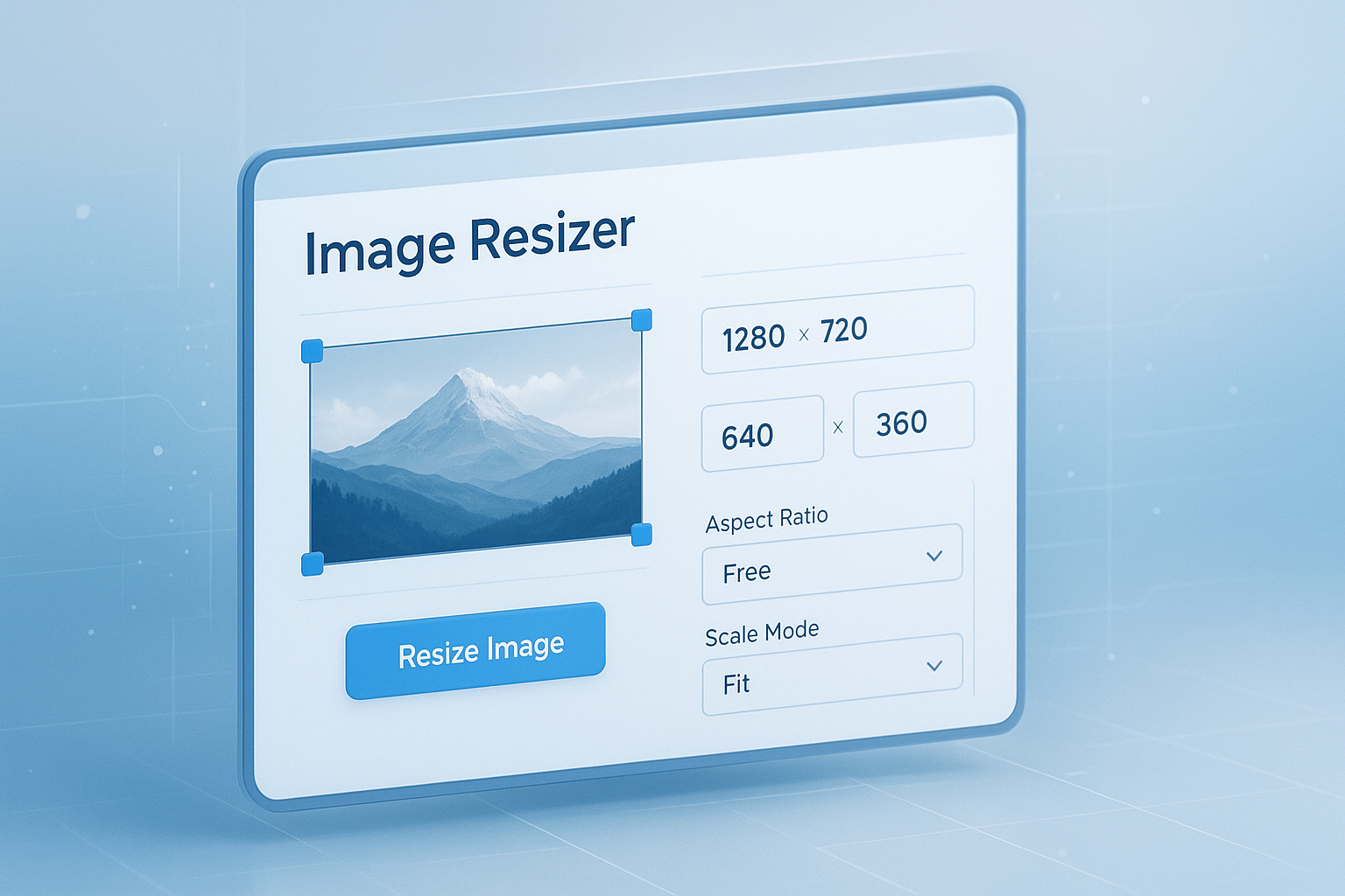
Ever uploaded a photo, logo, or screenshot only to realize it was too large, too wide, or completely wrong for the place you needed it? That happens all the time. A file that looks fine on your phone can break a webpage layout, fail a form upload, or appear blurry on social media.
An image resizer tool solves that problem fast. It lets you change image dimensions without opening complex design software or learning editing basics first. For beginners, that’s often the difference between getting the job done in seconds and wasting 30 minutes trying to fix one file.
This guide explains how online image resizing works, when to resize instead of compress, which dimensions to use, and how to avoid the mistakes that make images look stretched or pixelated. If you need cleaner images for websites, profiles, documents, or product listings, you’re in the right place.
Suggested Image: Technology concept showing image dimensions being adjusted on a laptop screen
What is an image resizer tool?
An image resizer tool is a simple utility that changes the width and height of an image file. It helps you make images fit specific size requirements for websites, social platforms, email attachments, forms, presentations, and digital documents.
When you resize an image, you are changing its dimensions in pixels, such as from 4000 × 3000 to 1200 × 900. That is different from changing only the file size. If you also need to make the file lighter for faster loading, use an Image Compressor after resizing.
Most people use an image resizer tool for one of these tasks:
- Preparing images for website uploads
- Matching social media post or profile sizes
- Reducing photo dimensions for online forms
- Making screenshots fit into documents or slides
- Adjusting product images for marketplaces
- Shrinking large images for easier sharing
According to MDN guidance on image optimization, correctly sized images help pages load more efficiently and improve the user experience. That matters whether you’re managing a blog, a shop page, or a basic portfolio.
Why resizing images matters more than most beginners think
Image size affects more than appearance. It influences page speed, layout stability, upload compatibility, and how professional your content looks. A correctly sized image loads faster, fits better, and is easier to reuse across platforms.
Here’s the problem. Many beginners upload the original file straight from a phone or camera. Those images are often much larger than necessary. A modern phone photo might be several thousand pixels wide, even if the website only displays it at 800 pixels.
That creates several issues:
- Slow page loading
- Oversized media libraries
- Failed uploads on websites with file limits
- Blurry images when resized the wrong way
- Distorted visuals when aspect ratio is ignored
Google highlights performance and page experience as important technical considerations, and image optimization is a direct part of that. You can review this in Google Search Central documentation.
If you’re also publishing graphics with text, dimensions matter even more. A banner that is too small may look soft. One that’s too large may be cropped unexpectedly on mobile devices.
Resize vs compress: what’s the difference?
Resizing changes dimensions. Compression reduces file size. Sometimes you need one. Often you need both. Knowing the difference will help you choose the right fix instead of making random edits.
| Task | What It Changes | Best Use Case |
|---|---|---|
| Resize | Image width and height in pixels | Making an image fit a required dimension |
| Compress | File size in KB or MB | Speeding up loading and meeting upload limits |
| Crop | Visible area of the image | Removing extra space or fitting a shape |
A practical workflow looks like this:
- Resize the image to the correct dimensions
- Compress it if the file is still too large
- Convert the format if needed for compatibility
If your final file must be in another format, a related WebP to PNG tool can help when a website or app doesn’t accept WebP.
How to use an image resizer tool online
Most online resizers follow the same basic process. You upload the image, enter the target width and height, keep proportions locked if needed, and download the resized version. For beginners, it’s one of the easiest image edits to learn.
- Upload your image file
- Choose the new width and height
- Keep the aspect ratio locked if you want to avoid stretching
- Preview the output if the tool supports it
- Download the resized image
Now comes the important part. Before entering random numbers, check where the image will be used. A blog image, a LinkedIn profile image, and a PDF attachment may all require different dimensions.
If you need help working out proportional values, a Aspect Ratio Calculator is useful for keeping images visually balanced while changing size.
When should you lock the aspect ratio?
Lock the aspect ratio when you want the image to keep its original shape. This avoids stretching faces, logos, screenshots, and product photos. In most beginner cases, leaving the ratio locked is the safest option.
Unlock it only when the final space demands an exact shape and you’re willing to crop or accept some distortion. That is common for thumbnails, ad slots, and profile cover images.
What happens if you enlarge a small image?
If you increase dimensions beyond the image’s original quality, it may look soft, grainy, or pixelated. Resizing down usually works well. Resizing up is where many people struggle, because detail cannot be magically recreated.
For logos, icons, or text graphics, using the right format matters too. The W3C SVG overview explains why vector graphics scale differently from standard photo formats like JPG and PNG.
Best image dimensions for common uses
The right dimensions depend on where the image will appear. There is no single perfect size. The smartest approach is to resize based on the platform, layout, or upload requirement you actually need.
| Use Case | Suggested Dimensions | Notes |
|---|---|---|
| Blog content image | 1200 × 800 | Works well for many article layouts |
| Website hero banner | 1600 × 900 or wider | Check mobile cropping before publishing |
| Instagram square post | 1080 × 1080 | Keeps feed image sharp |
| Presentation image | 1280 × 720 | Matches common slide displays |
| Email or attachment image | 800 × 600 | Smaller size is easier to send |
| Online form upload | Varies by platform | Always check file limit and pixel rules |
For modern web performance, image file types matter too. Google’s WebP documentation explains why newer formats can reduce file weight while keeping quality acceptable in many use cases.
Suggested Infographic: Common image dimensions for blogs, social media, forms, and presentations
How to maintain image quality while resizing
The best resized image is the one that looks clean and loads quickly. To get that result, use the smallest dimensions that still look sharp in the final placement. Bigger is not always better.
Here’s what experienced professionals do differently:
- They resize for the actual display area, not for guesswork
- They keep the aspect ratio consistent unless cropping is intentional
- They avoid enlarging tiny images too much
- They compress after resizing when file size is still high
- They choose the right format for the content type
Choose the right format
Different image formats solve different problems:
- JPG or JPEG: Best for photos and complex images
- PNG: Useful for transparency, logos, UI elements, and screenshots
- WebP: Good for web performance in many modern browsers
- SVG: Ideal for vector graphics like icons and simple logos
If you need to switch file types for compatibility, tools like PNG to JPG can simplify the process after resizing.
Check how the image will be displayed
An image that looks fine at full size may appear poor inside a small container, or the opposite may happen. Test the resized image where it will actually appear: on a webpage, in a document, inside a profile card, or in a mobile view.
For web projects, MDN’s HTML image element documentation is a helpful reference for understanding how browsers display images and scale them in responsive layouts.
Common mistakes people make with an image resizer tool
Most image issues come from a few repeated mistakes. The good news is they are easy to avoid once you know what to look for. A careful resize usually takes less than a minute.
- Using random dimensions: Always resize with a purpose
- Ignoring aspect ratio: This causes stretched or squashed images
- Only compressing but not resizing: The file may still be too wide
- Resizing the same image multiple times: Repeated editing can reduce quality
- Uploading oversized originals: This wastes bandwidth and storage
- Choosing the wrong format: For example, using JPG for transparent graphics
This small detail changes everything: always keep a copy of the original file. If the new size looks wrong, you can start again without stacking quality loss on top of previous edits.
If you’re preparing graphics that include dimensions, spacing, or layout calculations, a practical helper like the Percentage Calculator can make scaling decisions quicker when you’re adjusting images by percentage instead of fixed pixels.
When to resize images for websites, social media, and documents
Each platform has different expectations. Website images should balance quality and speed. Social media images should match platform ratios. Document images should stay readable without making files too heavy.
For websites
Resize images before uploading whenever possible. That reduces page weight, improves load times, and prevents oversized images from being served unnecessarily. If you are also working on page structure or metadata, tools such as a Meta Tag Generator support the broader SEO side of publishing.
For social media
Use exact dimensions or close platform-approved ratios. Social platforms crop aggressively in previews, and text overlays can be cut off if the image shape is wrong. A resized image gives you more predictable results than letting the platform do the resizing for you.
For PDFs and forms
Many forms reject images that are too large in file size or dimensions. If you’re assembling files for applications, contracts, or submissions, resizing images first can make the final document easier to manage. For image-based documents, a related JPG to PDF tool may be useful after you’ve prepared the visuals.
Step-by-step example: resizing an image for a blog post
Let’s break this down with a simple example. Imagine you took a photo on your phone and want to add it to a blog article. The original image is 4032 × 3024 pixels and far larger than needed.
- Decide where the image will appear in the article
- Choose a practical target size, such as 1200 × 900
- Upload the original file into the image resizer tool
- Keep the aspect ratio locked
- Resize to 1200 pixels wide
- Download the new version
- Compress it if the file is still larger than you want
- Preview it on desktop and mobile before publishing
That process usually creates a cleaner, faster-loading image without visible loss for normal blog use. If you also need SEO-friendly filenames or text support around the image, a related Word Counter can help when tightening captions, alt text drafts, or surrounding copy.
Suggested Screenshot: Example workflow showing upload, dimension input, and resized output download
How to choose the right dimensions if you don’t know the required size
If the platform does not tell you exactly what size to use, start with the display context. Measure the content area, review any design template, or inspect the image slot visually. Then resize close to that target rather than guessing far above it.
A simple decision process helps:
- Find where the image will appear
- Check the visible width of that space
- Use a proportionate height based on the original ratio
- Test the resized image in context
- Adjust only if the preview shows quality or cropping problems
If you’re unsure about pixel values versus screen units, MDN’s guide to CSS values and units is useful for understanding how dimensions relate to web layouts.
Frequently asked questions
Is an image resizer tool free to use?
Many online image resizing tools are free for basic tasks, especially when you only need to change width and height. Some platforms add limits for batch processing, premium formats, or advanced editing. For beginners, a simple free tool is usually enough for web uploads, social posts, school work, and basic documents. Always check whether the tool also reduces file size or only changes dimensions.
Will resizing an image reduce quality?
It can, but not always in a noticeable way. Reducing image dimensions usually works well if the new size matches the place where the image will be displayed. Quality problems appear more often when users enlarge small images, repeatedly re-edit the same file, or choose an unsuitable format. The safest approach is to keep the original file and create a new resized copy for each use.
What size should I use for website images?
The best size depends on the layout. For many blog content images, 1200 pixels wide is a practical starting point. Banners may need 1600 pixels or more, while thumbnails can be much smaller. Focus on the display area, not the camera’s original size. Resize for the actual website slot, then compress if needed so the image loads quickly without looking soft.
Can I resize images on my phone?
Yes. Most online image resizer tools work on mobile browsers, which makes them convenient for quick edits without installing software. This is especially helpful when you’re submitting forms, updating a profile picture, or sending smaller files by email. The main thing to watch on mobile is accidental distortion. Keep the aspect ratio locked unless you intentionally need a different shape.
Should I resize or compress first?
In most cases, resize first and compress second. Resizing removes unnecessary dimensions, which gives compression less data to work with. That often leads to better results and cleaner output. If you compress a huge image before resizing it, you may still end up with a file that is wider than needed. A simple workflow is resize, review quality, then compress if file size remains too high.
Is it safe to upload images to an online resizer?
That depends on the tool and the sensitivity of the image. For ordinary photos, screenshots, or web graphics, online resizing is usually fine when using a reputable service. For personal IDs, confidential business documents, medical content, or private legal files, be more careful. Review the platform’s privacy practices first. When in doubt, use a trusted local editing method instead of uploading sensitive material.
Why does my resized image look stretched?
Stretching usually happens when width and height were changed independently without preserving the original aspect ratio. For example, forcing a square shape onto a rectangular image will distort faces, objects, and text. To avoid this, keep proportions locked or crop the image to the shape you need before resizing. If sharpness is also poor, the image may have been enlarged too much.
Which format is best after resizing: JPG, PNG, or WebP?
Use JPG for photos, PNG for graphics that need transparency or crisp interface elements, and WebP for many modern web use cases where lower file size matters. There is no universal winner. The right choice depends on the image content and where it will be used. If compatibility is the top concern, JPG and PNG remain widely accepted across platforms, forms, and older workflows.
Final thoughts on using an image resizer tool
An image resizer tool is one of the fastest ways to fix oversized, awkward, or upload-blocking images without using advanced software. For beginners, the key is simple: choose the right dimensions for the final use, keep the aspect ratio intact unless cropping is intentional, and compress afterward if the file is still too large.
If you’re not sure where to start, resize one image for a real task first. A blog photo, a form upload, a social media post, or a document image is enough to learn the workflow.
To keep improving your image and content workflow, related FreeToolr tools worth exploring include the Image Compressor, Aspect Ratio Calculator, PNG to JPG, and JPG to PDF. Used together, they make online publishing and file preparation much easier.